In this tutorial we will learn how to perform Drag & Drop in your JSF applications using PrimeFaces library.
Drag & Drop with PrimeFaces
Drag-and-drop is an action, meaning grabbing an object and dragging it to a different location. Components capable of being dragged and dropped enrich the Web and make a solid base for modern UI patterns. The drag-and-drop utilities in PrimeFaces allow us to create draggable and droppable user interfaces efficiently. They make it abstract for developers to deal with the implementation details on a browser level.
In this tutorial, we will learn about PrimeFaces’ drag-and-drop utilities: Draggable and Droppable. AJAX-enhanced drag-and-drop and a special integration with data iteration components will be explained as well.
A component can be made draggable by using p:draggable. The component ID must match the for attribute of the p:draggable component. If the for attribute is omitted, the parent component will be selected as a draggable target. Let’s make some panel components draggable and apply some basic features:
    <p:panel id="pnl" header="Draggable panel with default settings">
            <h:outputText value="Drag me around" />
        </p:panel>
        <p:draggable for="pnl" />
        <p:panel id="hpnl" header="Draggable panel by handle">
            <h:outputText value="I can be only dragged by my header" />
        </p:panel>
        <p:draggable for="hpnl" handle=".ui-panel-titlebar" />
        <p:panel id="cpnl" header="Draggable panel with clone">
            <h:outputText
                value="I display a clone as helper while being dragged" />
        </p:panel>
        <p:draggable for="cpnl" helper="clone" />
        <p:panel id="rpnl" header="Draggable panel with revert">
            <h:outputText
                value="I will be returned to my start position when dragging stops" />
        </p:panel>
        <p:draggable for="rpnl" revert="true" />
        <p:panel id="opnl" header="Draggable panel with opacity">
            <h:outputText value="I use opacity for helper while being dragged" />
        </p:panel>
        <p:draggable for="opnl" opacity="0.5" />
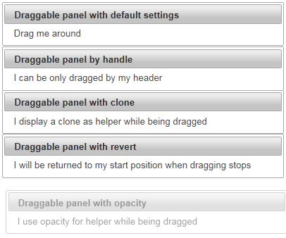
The following screenshot shows the five panels. The last panel is being dragged. Its opacity has been changed to 0.5 after dragging starts.
How it works
By default, any point in a dragged component can be used as a handle. To restrict the drag-start click to a specified element(s), we can use the handle option, which is a jQuery selector. The second panel is dragged by using its header only.
By default, the actual component is used as a drag indicator. The helper option allows keeping the component at its original location during dragging. This can be achieved with helper set to clone as for the third panel.
If the revert option is set to true, the component will return to its starting position when dragging stops and the draggable component is not dropped onto a matching droppable component. The fourth panel features this behavior.
Opacity for helper while it is being dragged is another useful option to give the user a visual feedback. The opacity of the fifth panel is reduced when dragging.
Defining droppable targets
Any component can be enhanced with a droppable behaviour. Droppable components are targets for draggable ones. To enable droppable functionality on any PrimeFaces component, we always need a component called Droppable. In this recipe, we will see how to defi ne droppable targets and learn a client-side callback onDrop.
How to do it
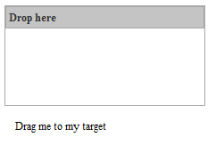
A component can be made droppable by using p:droppable. The component ID must match the for attribute of p:droppable. If the for attribute is omitted, the parent component will be selected as a droppable target. We will take two h:panelGroup components and make them droppable and draggable respectively. In addition, we will define a client-side callback that gets invoked when a draggable component is dropped. This can be accomplished by the onDrop attribute, which points to a JavaScript function.
    <h:panelGroup id="drop" layout="block" styleClass="ui-widget-content"
        style="height:150px;width:300px;">
        <p class="ui-widget-header" style="margin: 0; padding: 5px;">Drop
            here</p>
        <p:droppable onDrop="handleDrop" />
    </h:panelGroup>
    <br />
    <h:panelGroup id="drag" layout="block"
        style="height:150px;width:300px;">
        <p>Drag me to my target</p>
    </h:panelGroup>
    <p:draggable for="drag" />
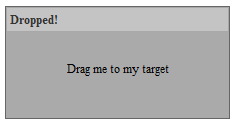
The client-side callback highlights the droppable h:panelGroup component and adds the text Dropped! to the paragraph tag p when invoked.
<script>
function handleDrop(event, ui) {
$(event.target).addClass("ui-state-highlight").find("p").html("Dropped!");
}
</script>
Before……
……After
How it works
The onDrop callback gets two parameters: event and ui, which are objects holding information about the drag-and-drop event. The droppable target is accessible by event.We use this fact to add the style class ui-state-highlight to the target. This class is defined by jQuery ThemeRoller. The event parameter is the original browser event, and ui is a prepared object with the following properties:
- ui.draggable: This is the current draggable element,an jQuery object
- ui.helper: This is the current draggable helper,an jQuery object
- ui.position: This is the current position of the draggable helper { top: , left: }
- ui.offset: This is the current absolute position of the draggable helper { top: , left: }
Using Drag and Drop with PrimeFaces File Upload
Some components like the <p:fileUpload /> are natively able to perform Drag and Drop. For example, in order to allow Drag and Drop in your Forms, simply set the dragDropSupport attribute to “true” as in the following example:
<h:form>
    <p:fileUpload fileUploadListener="#{fileUploadView.handleFileUpload}" mode="advanced" dragDropSupport="true"
                          update="messages" sizeLimit="100000" allowTypes="/(\.|\/)(gif|jpe?g|png)$/" />

    <p:growl id="messages" showDetail="true" />
</h:form>
The Backing Bean FileUploadView is needed to provide messages notification to the FacesContext:
import javax.faces.application.FacesMessage;
import javax.faces.bean.ManagedBean;
import javax.faces.context.FacesContext;

import org.primefaces.event.FileUploadEvent;
import org.primefaces.model.UploadedFile;

@ManagedBean
public class FileUploadView {

    public void handleFileUpload(FileUploadEvent event) {
        FacesMessage message = new FacesMessage("Succesful", event.getFile().getFileName() + " is uploaded.");
        FacesContext.getCurrentInstance().addMessage(null, message);
    }
}
Using Drag and Drop with PrimeFaces Datatable
As you can see from Primefaces showcase, using Drag & Drop with PrimeFaces datatable is quite straightforward. The javascript callback function handleDrop will provide the animation effect to be applied when the component is dropped. Also, one of the columns (the one containing the dragIcon) has the <p:draggable> element which means you can drag it. Where can it be dropped ? In a corresponding <p:droppable />
<script type="text/javascript">
    function handleDrop(event, ui) {
        var droppedCar = ui.draggable;
        droppedCar.fadeOut('fast');
    }
</script>

<h:form id="carForm">
    <p:fieldset id="availableCarsField" legend="Available Cars">
        <p:dataTable id="availableCars" var="car" value="#{dndCarsView.cars}">
            <p:column style="width:20px">
                <h:outputText id="dragIcon" styleClass="ui-icon ui-icon-arrow-4" />
                <p:draggable for="dragIcon" revert="true" helper="clone"/>
            </p:column>

            <p:column headerText="Id">
                <h:outputText value="#{car.id}" />
            </p:column>

            <p:column headerText="Year">
                <h:outputText value="#{car.year}" />
            </p:column>

            <p:column headerText="Brand">
                <h:outputText value="#{car.brand}" />
            </p:column>

            <p:column headerText="Color">
                <h:outputText value="#{car.color}" />
            </p:column>
        </p:dataTable>
    </p:fieldset>

    <p:fieldset id="selectedCars" legend="Selected Cars" style="margin-top:20px">
        <p:outputPanel id="dropArea">
            <h:outputText value="!!!Drop here!!!" rendered="#{empty dndCarsView.droppedCars}" style="font-size:24px;" />
            <p:dataTable id="selectedCarsTable" var="car" value="#{dndCarsView.droppedCars}" rendered="#{not empty dndCarsView.droppedCars}">
                <p:column headerText="Id">
                    <h:outputText value="#{car.id}" />
                </p:column>

                <p:column headerText="Year">
                    <h:outputText value="#{car.year}" />
                </p:column>

                <p:column headerText="Brand">
                    <h:outputText value="#{car.brand}" />
                </p:column>

                <p:column headerText="Color">
                    <h:outputText value="#{car.color}" />
                </p:column>

            </p:dataTable>
        </p:outputPanel>
    </p:fieldset>

    <p:droppable for="selectedCars" tolerance="touch" activeStyleClass="ui-state-highlight" datasource="availableCars" onDrop="handleDrop">
        <p:ajax listener="#{dndCarsView.onCarDrop}" update="dropArea availableCars" />
    </p:droppable>

</h:form>
As you can see, in order to handle the clone of the dndCarsView List, another List has been added to the dndCarsView called droppedCars. Each time a Drop Event occurs, the onCarDrop method receives a callback where the Car object is added into the List<Car> droppedCars:
public class DNDCarsView implements Serializable {

    @ManagedProperty("#{carService}")
    private CarService service;

    private List<Car> cars;

    private List<Car> droppedCars;

    private Car selectedCar;

    @PostConstruct
    public void init() {
        cars = service.createCars(9);
        droppedCars = new ArrayList<Car>();
    }

    public void onCarDrop(DragDropEvent ddEvent) {
        Car car = ((Car) ddEvent.getData());

        droppedCars.add(car);
        cars.remove(car);
    }

    public void setService(CarService service) {
        this.service = service;
    }

    public List<Car> getCars() {
        return cars;
    }

    public List<Car> getDroppedCars() {
        return droppedCars;
    }

    public Car getSelectedCar() {
        return selectedCar;
    }

    public void setSelectedCar(Car selectedCar) {
        this.selectedCar = selectedCar;
    }
}


